I spend my days looking at things. Not in a casual way—in a professional one. When you work as a freelance illustrator, you develop a kind of visual second nature. You learn to see what most people skip past: the weight of a line, the temperature of a color, the way negative space can feel as heavy as the objects that surround it.
That training doesn't switch off when I close my sketchbook. It follows me into games.
And over the years, I've realized that the way I read images for a living has quietly become the way I read game worlds. Not as a critic, not as a reviewer—as someone who spends his days deciding where a line should go and what a color should do.
Here's what that looks like.
Color as Emotional Architecture
Most people see color in games as decoration. Pick a palette that looks nice, apply it to the world, move on.
But color isn't decoration. It's architecture. It structures how you feel before you've even registered what you're looking at.
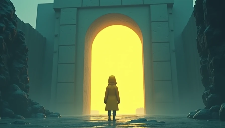
Game designers use color theory to evoke emotions, guide players, and enhance the overall experience. A limited color scheme isn't a budget constraint—it's an emotional tool that allows the atmosphere to affect the player for a longer period of time. Warm hues create comfort or excitement; cool hues suggest calmness or detachment.
I notice this immediately in games like Gris. Each section of that game reflects a distinct emotional condition through deliberate shifts in color palette. The world isn't just colored—it's felt through color. You don't need dialogue to know when something has shifted. The palette tells you.
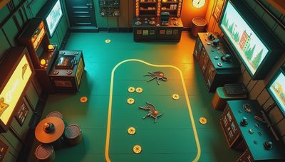
And then there's Chronoscript, which rejects the polished color palettes of prestige indies entirely. Its world looks unstable, unrefined—alive in ways that cleaner palettes often aren't. The colors bleed. The lines shake. It's a reminder that emotional architecture doesn't always mean beautiful architecture. Sometimes it means honest architecture.
When I'm illustrating a poster or an editorial piece, I spend hours deciding on a palette. Not because I can't pick one—because the choice matters. The same is true in games. The color story a game tells isn't optional. It's the first thing your subconscious reads.
Composition and the Unspoken Contract
Here's something I think about constantly: where is the game looking?
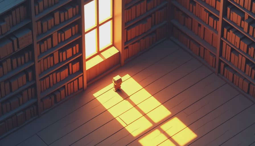
Every image has a center of gravity. In illustration, you learn to control where the viewer's eye goes—through contrast, through line, through the placement of figures and objects. You're not just drawing a picture. You're drawing a path for the eye to follow.
Games do the same thing, but with an added layer: they have to guide you through the image, not just across it.
Level designers use visual hierarchy to mark the intended path, making the desired route stand out through color contrast, lighting, and object placement. They use leading lines to subtly direct the player without breaking immersion. Every composition is a quiet instruction: go here, look at this, this matters.
I notice when games get this wrong. When the visual hierarchy is muddled, when the eye doesn't know where to land, when important elements compete with unimportant ones. It feels like reading a sentence with no punctuation—you can still understand it, but it takes more work than it should.
And I notice when they get it right. The games that understand composition on a deep level don't need to tell you where to go. You just know. The image has already decided. You're simply following its logic.
The Interface as Emotional Distance
This is the one that most players don't think about—and that's exactly the point.
A good interface disappears. A great one shapes how you feel without you ever noticing it's there.
Fumito Ueda put it simply: "Minimalism amplifies emotional impact. Remove everything that doesn't serve the experience." Jenova Chen said something similar: "The interface should be invisible—players should feel, not read."
I think about this every time I open a game's menu. The typeface, the spacing, the way information is prioritized, the amount of visual noise between me and the game itself—all of it changes my emotional distance from what I'm about to experience.
A cluttered, utilitarian UI puts me in a practical frame of mind. I'm managing systems. I'm optimizing. I'm working.
A clean, considered UI—one that treats its menus with the same care as its world—keeps me in an emotional frame of mind. I'm not managing. I'm inhabiting.
This is something I carry from illustration. Every poster I design has a hierarchy of information. The headline is largest, the body text smaller, the credits smallest. That hierarchy isn't arbitrary—it controls how you enter the piece. Games do the same thing with their interfaces. The hierarchy of information on screen tells you, before you've done anything, what kind of experience this is going to be.
Space as Narrative
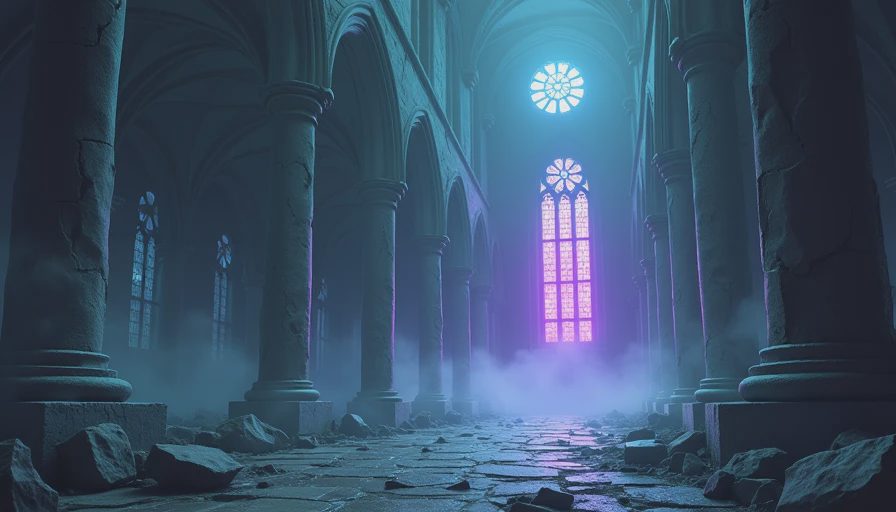
In illustration, empty space isn't empty. It's active. It carries weight. It frames what's there by defining what isn't.
Games that understand this use space as narrative. Not just as a placeholder between objects, but as a deliberate choice about what the world is.
Environmental storytelling relies on players actively interpreting what they see, rather than simply receiving information that is explicitly told to them. Players tend to associate disparate visual and spatial elements together and construct a meaningful whole. And it's not conveyed through isolated details, but through the gradual accumulation of visual and atmospheric changes across zones.
I notice this in games like Journey, where the vast emptiness of the desert isn't a technical limitation—it's a feeling. The space between you and the mountain is part of the story. The distance isn't a gap to be crossed. It's a relationship to be experienced.
I notice it in horror games that use lo-fi visuals deliberately—not because they can't afford photorealism, but because the visual glitches and low-resolution textures feel organic to the experience. The space feels broken because it is broken. The visual language and the narrative are the same thing.
When I'm sketching after playing a game, I often find myself drawing the spaces more than the characters. The rooms. The corridors. The empty fields. Because that's what stays with me—not the people, but the room they were in.
What Illustration Taught Me
Here's what I've come to understand.
Illustration taught me that every visual choice is a decision. Nothing is neutral. The line you draw, the color you pick, the space you leave empty—all of it communicates something. All of it carries weight.
Games are the same way. Every visual choice in a game—every palette, every composition, every UI element, every empty corridor—is a decision about what the player should feel and how they should experience the world.
The games that stay with me are the ones where those decisions feel owned. Where the visual language isn't borrowed or tentative, but settled. Where every frame feels like it was considered by someone who understood that what you don't show is as important as what you do.
That's what I look for now. Not polish. Not fidelity. Not even beauty, exactly. Intentionality. The sense that someone made a thousand small decisions and every single one of them mattered.
If it stays with you, it counts.
And the games that understand their own visual language? They stay.