People often reduce art direction to a single question: does it look nice?
It is a reasonable question, and an incomplete one. Looking nice is the easiest part of visual design to notice and the least interesting part to discuss. The more useful question is what the art direction is actually doing—how it shapes the distance between you and the world, how it controls the emotional temperature of a scene, and how it either supports or quietly undermines the act of playing.
Good art direction is not decoration applied after the systems are finished. It is one of the primary ways a game decides what kind of experience it wants to be.
Visual decisions that change how a game feels
Consider the interface. A menu that sits close to the center of the screen with soft edges and restrained color can make the player feel invited into the world. The same information presented as a sharp, high-contrast overlay can create a deliberate sense of separation. Neither choice is inherently better. Both are statements about emotional distance. Most players never consciously register the difference, but their bodies do.
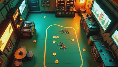
Color works the same way. A palette is not merely a set of attractive hues. It is a system for distributing attention and feeling. Warm, desaturated tones can make a space feel lived-in and slightly tired. High-saturation accents against muted grounds can turn ordinary objects into points of tension. When color is used only to “look good,” it tends to flatten. When it is used as information—emotional, spatial, hierarchical—it begins to do real work.

Composition and empty space matter more than most reviews acknowledge. The amount of screen real estate a game is willing to leave quiet is often a better indicator of confidence than any number of detailed assets. Crowded frames can feel energetic or anxious depending on how the elements are weighted. Sparse frames can feel generous or cold. These are not aesthetic preferences floating above the gameplay. They directly influence how long a player is willing to stay inside a moment, and whether that moment feels intentional or merely unfinished.
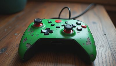
Animation and movement carry their own visual language. The weight of a character’s step, the follow-through of a coat or a cape, the slight delay before a camera settles—these details do not only look refined. They change how responsive or heavy the controls feel in the hand. A game can have precise inputs and still feel floaty or disconnected if the visual feedback refuses to confirm the physicality the systems are claiming.
When polish becomes emptiness
There is a particular kind of modern indie (and AAA) look that is technically competent and emotionally vacant. Clean lighting. High-resolution textures. Careful post-processing. Everything is legible, nothing is particular. The world looks expensive and feels generic. You can admire the craftsmanship and still leave with no residual image.
That is the difference between art direction that is merely executed and art direction that is considered. The former produces screenshots that perform well. The latter produces experiences that stay.
I notice this most clearly in the first hour. A game that already understands its visual temperature early tends to remain coherent later. A game that is still searching for its look while teaching you systems often never fully recovers. The early visual decisions are not a preview of the art. They are the foundation of the feeling.
What illustration taught me to look for
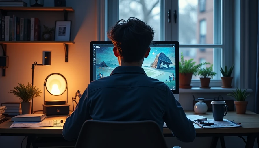
Working as an illustrator has made certain habits difficult to turn off. I pay attention to the weight of a line, the temperature of a shadow, the decision to leave something unresolved. Those same instincts apply when I play. I notice when a UI element is fighting the mood of the scene it sits on top of. I notice when a color relationship is doing more emotional work than the dialogue. I notice when the camera framing treats the player like a visitor rather than a participant.
None of this requires technical knowledge of shaders or pipelines. It only requires the willingness to treat visual choices as meaningful rather than ornamental.
The quieter standard
I am not interested in ranking games by how beautiful their screenshots are. Beauty is common enough. What is rarer is visual intelligence—the sense that every major decision about color, space, interface, and movement was made in service of a specific feeling, and that the feeling survives after the screen goes dark.
That is the standard I use here.
If the art direction is only “looking nice,” it has already failed the more important test. If it changes how the game feels to move through, how long a moment is allowed to breathe, and what remains in the mind afterward, then it is doing the work that matters.
Looking nice is the surface.
The rest is the point.