
Most indie games still look as if they are asking permission.
They hedge their visual decisions. They add extra detail where a cleaner choice would have been stronger. They soften contrasts, over-explain space with UI, or borrow too many familiar indie visual habits at once so that nothing feels fully owned. The result is often pleasant and rarely decisive.
The game I finished this month did not ask permission.
From the first frame it treated its visual system as settled. The compositions were not exploratory; they were final. The limited set of visual tools it allowed itself was used without apology or decoration. Nothing felt provisional. Nothing felt as if it were waiting for a later upgrade in fidelity or style.
Confidence as refusal
Visual confidence is rarely about how many techniques a game can display. It is more often about how many it is willing to decline.
This one declined the usual safety options. It did not fill frames to avoid emptiness. It did not soften every edge to remain likable. It did not introduce secondary visual languages when the primary one was already sufficient. The restrictions felt chosen rather than budgeted. Because the limits were clear, every element that did appear carried more weight.
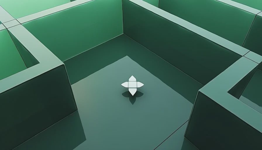
I noticed it most in the way the game handled negative space and hierarchy. Important forms were allowed to sit without competition. Secondary information stayed secondary. The eye was not constantly renegotiating what mattered. The image had already decided.
No visual throat-clearing
Many games spend their early sequences clearing their throat visually—trying out lighting setups, testing how much texture is enough, adjusting the distance between the camera and the subject until something feels safe. This one skipped that stage. The relationship between figure, ground, and frame was already resolved. The player was simply invited to inhabit a look that had finished arguing with itself.
That absence of hesitation changed the experience of playing. I did not spend time waiting for the game to “find” its appearance. It had already arrived. The rest of the runtime was spent inside a visual decision rather than watching one being made.

Ownership over reference
There are games that look interesting because they skillfully combine existing references. There are fewer that look inevitable, as if the images could not have been otherwise. This one leaned toward the second category. Even when individual elements felt familiar, the overall system of decisions felt owned. The confidence was not loud. It was simply the lack of any visible desire to be something else.
I am not interested in ranking games by how striking their screenshots are. Striking is easy to achieve for a single image. Sustaining a coherent, unapologetic visual stance across an entire experience is harder, and rarer.
This month I played one that managed it.
It did not perform its style.
It simply continued to be itself, frame after frame, without once looking back to check whether the choice was still acceptable.