
I almost never start a game by opening the options menu first.
This time I did, and I stayed there longer than I meant to.
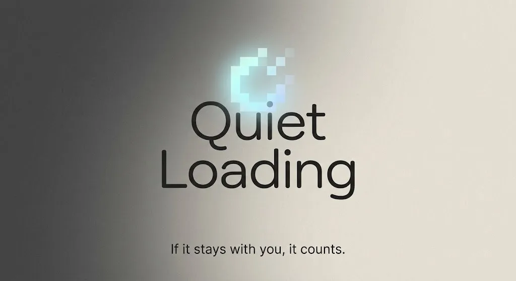
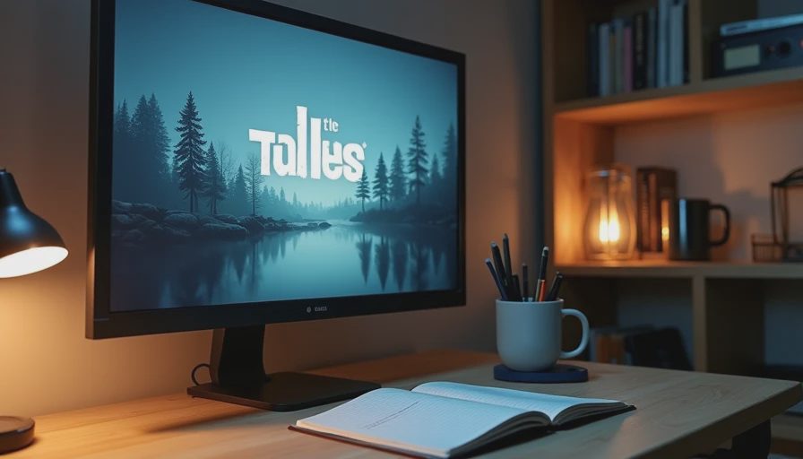
The title screen was already quiet. No animated logo sequence fighting for attention. No layered particle effects. Just a restrained composition, a limited palette, and a single soft sound that felt more like a held breath than a fanfare. When I opened the menu, the same visual logic continued without interruption. The type sat with careful weight. The spacing was generous. The cursor moved with a slight, deliberate resistance that matched the mood the title screen had already established.
I had not played a single second of the game yet. I already knew I was in good hands.
What a menu is actually saying
Most menus are treated as necessary infrastructure. They hold volume sliders, brightness controls, language options, and the occasional accessibility toggle. Functionally they are fine. Visually they are often an afterthought—an interface layer dropped on top of a world that was designed with more care.
When a menu is considered, it becomes something else. It is the first complete sentence the game speaks in its own visual language. It tells you how close the designers want you to feel to the experience. It tells you whether the world is meant to feel soft or sharp, intimate or distant, warm or slightly cold. It establishes the emotional temperature before any character has moved or any system has been explained.
In this case, the menu did not try to impress. It simply refused to break the mood. The background remained part of the same image. The typography did not suddenly become louder or more generic. The transitions were slow enough to feel intentional and fast enough not to become precious. Everything about it suggested that the people who made the game had already decided what the experience was supposed to feel like, and they were not willing to abandon that decision for the sake of conventional UI patterns.
The quiet test of confidence
There is a particular kind of confidence that shows up early. It is not the confidence of spectacle. It is the quieter kind that comes from knowing exactly how much is enough.
A menu that understands this will often do less rather than more. It will leave space. It will let color relationships remain subtle. It will avoid the nervous urge to fill every corner with information or decoration. That restraint is harder to achieve than it looks. It requires the designers to trust that the player can feel the tone without being constantly reminded of it.
I have opened many polished menus that looked expensive and still felt generic. The craftsmanship was visible; the point of view was not. This one had a point of view. It already felt like a place rather than a set of options.
Why it mattered
I eventually closed the menu and started playing. The game that followed was consistent with what those early screens had promised. The same care with spacing, the same control of temperature, the same refusal to overstate. But the important part had already happened. The menu had convinced me that the visual decisions were not going to be abandoned once the “real” game began.
That is rarer than it should be.
Most games ask you to wait until the first level or the first cutscene before revealing their true aesthetic priorities. A smaller number are already telling the truth in the pause screen. When that happens, the first hour becomes less of a test and more of a confirmation.
I still think about the way that cursor moved.
The slight weight of it.
The way the type sat against the background without needing to announce itself.
It was only a menu.
It was also the clearest statement of intent the game ever needed to make.
If the interface already feels like the world, the rest of the experience has a much higher chance of staying with you.